

Framework 6: Workload and Speed IV
Framework 6: Workload and Speed IV
Final "life gets in the way" exceptions

We all have a handful of roadway prototypes floating around in our minds. Life isn’t quite that simple. So far, we’ve seen that expecting human presence close to the vehicle makes the biggest difference. We know that speed doesn’t immediately change from block to block and interruptions make a big difference. The length of the viewshed also matters. As you might guess, the prediction formulas aren’t all that great for highways or rural roads, since I generated the formulas using urban and suburban street level roadways. Here are a few other problems that popped up as we were field testing them.
The 85th percentile speed is not enough information
It’s easy to pull the 85th percentile speed out of a tube count, but may not always tell you the whole story. Most roads experience pretty dramatic operational changes throughout the day that a single number can’t capture. That’s why I highly recommend engineers look at all of the speed points, not just the one variable.
Visualizing Speed Profiles
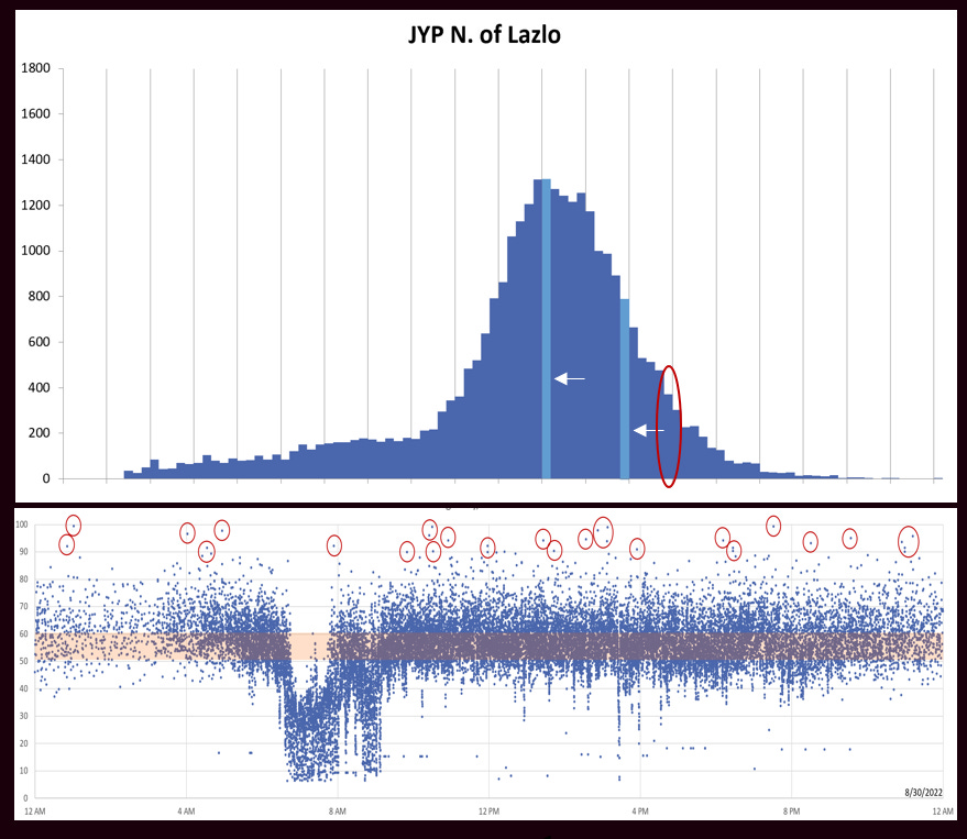
We’ll start with a speed profile that is pretty routine. Here is my standard layout for speed studies:
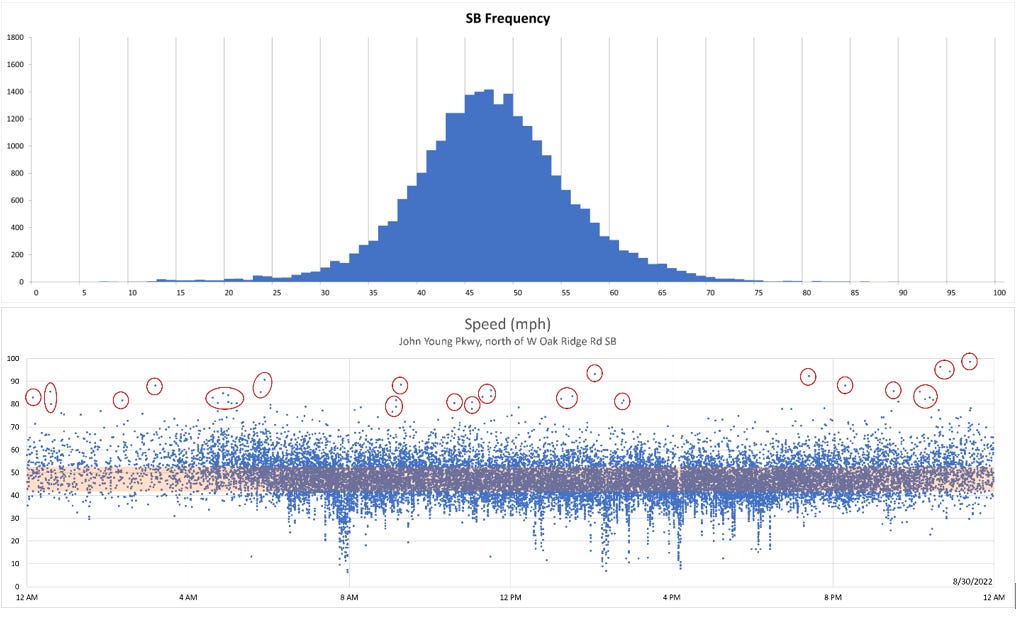
On the top is a histogram for speed. The height of the bars show how many people are going in each band of 1 mph and it looks like a pretty solid bell curve. There’s a few more people than normal going just over 45 mph, which means that people may believe the posted speed is near there (it’s not—it’s 55 mph). On the bottom is the speed plotted by time of day. The orange horizontal bar is the 10 mph pace: the band of speeds that contain the most drivers. There’s a line of hits around 17 mph—most of which are errors due to the 3 lanes of traffic going over the same hoses. Then there’s another pile of people that are going very, very fast—over 90 mph. Some of these could be errors, but the clustering pattern isn’t as flat, so it’s more likely that they’re real—and scattered all day long. When there’s a tightly coordinated signal system, you even see how the system goes in and out of coordination throughout the day. It looks like diagonal bands in the time of day plot.
This count is on a 6-lane roadway (170 feet of visual width) with 1900’ block spacing. It’s not a great place to go walking, though people do walk there. There is a 7’ sidewalk about 7’ from the back of curb with no shade and a vestigial 4’ on-street bike lane. I wouldn’t try it no matter how daring you are as a cyclist. You’re taking your life into your own hands. Obviously, there’s no doorways on the corridor but both of the historical Google Streetview images showed people walking on that sidewalk. One set of people over a 1/3 of a mile doesn’t look like much when you’re going by at 45 mph.
Out of place highways trying to be surface streets
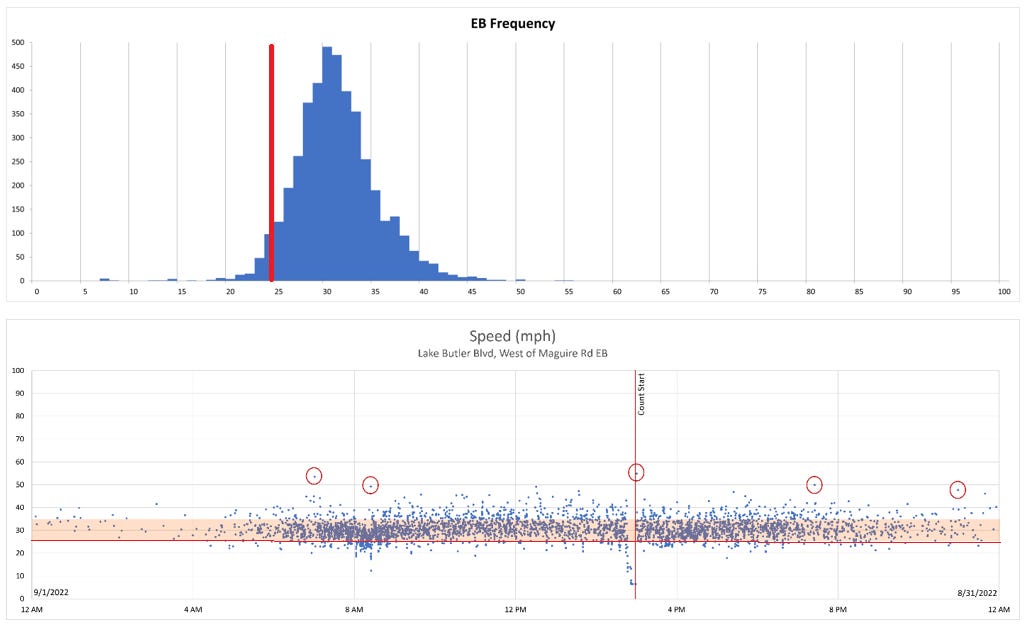
As you can see, just because you post it at 55 doesn’t mean that people will go 60 mph. The 85th percentile speed is 54.6 mph, which is 7 mph lower than the 61.5 mph the formula predicts. We’re getting out of range for using this type of prediction formula. It doesn’t work all that well for rural roads either. We included a handful of roadways like this one in our training data set, but not many, so it’s stretching how applicable those formulas will be when you’re looking at this type of roadway. It’s probably better to predict speed using the HCM prediction formulas because it’s really a highway, even if it’s got multimodal features.
In general, I found that the urban prediction formula over-predicts a bit for highway type surface streets in these multimodal developed areas (suburban or urban). The backage highways behind shopping centers show the same types of behavior—they’re fast because they look like a freeway, but not as fast as they could have been if they were really an open highway. Besides the slight behavioral changes because of the context, I suspect there are cap effects on the visual width of the corridor. Once it gets too wide, drivers discount the extra width and think of it as an open field. Replacing the 170 feet with 120 nets you the right prediction.
Congestion
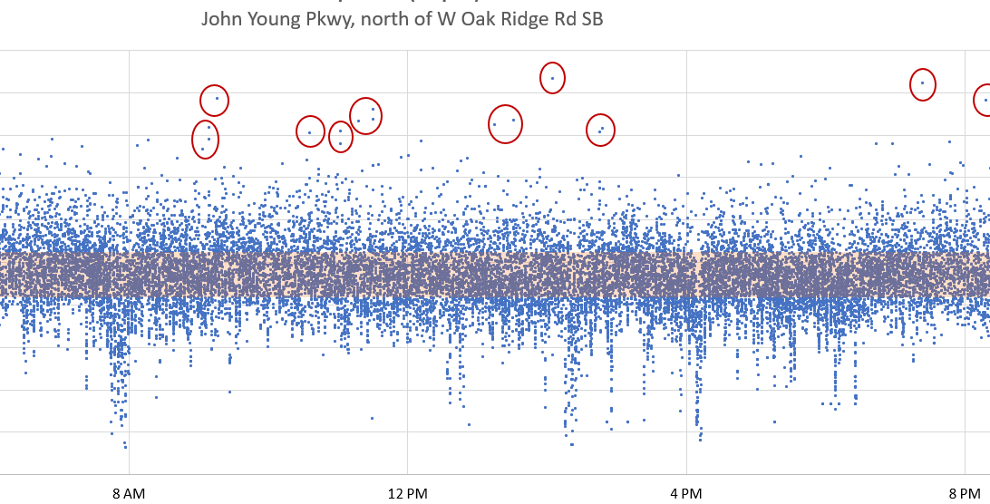
The feathering down on the time of day plot is where the congestion has backed the traffic up to or over the count location. (That’s why it’s a good idea to put your count site at the mid-block, not close to the intersections), but it’s not enough of a problem to mess up the 85th percentile speed. It looks like there’s a fair amount of congestion right before 8 and a short jam condition right around 4 pm: no surprise there. The afternoon is showing peak hour spreading from 2 pm to 7 pm. A crash would look like an abrupt sag in the points that lasts for a longer period of time—usually half an hour to two hours. If you have speeds for several weeks you can usually catch a crash or two and see how long it takes the system to recover—which is a handy metric for the system’s resiliency. By the way, if you sent someone out to do a hose count and there was a crash in the segment, it’s really likely they wouldn’t have any way of knowing that your data is not valid.
School Zones
Here’s a part of the time of day plot for same road at a different location, but right around the corner from a cluster of 3 schools—nearby but not on this road.
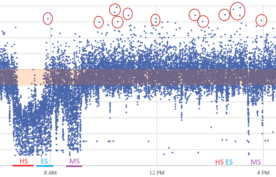
If you look closely, you can see all three school peaks. The High School starts at 7:15, so there’s a jam condition that begins around 6:30 (yes, the traffic is that bad). There’s both parents and kids driving and the school has around 3,000 students and all of it layered over the normal AM peak hour for the roadway. The sad thing is that the backup reaches out to our count station—1.5 miles away. Bus service is available, but only for those outside a 2 mile driving range. There’s about a 5 minute break in the congestion before the elementary school backup kicks in. That school is smaller but only 3/4 of a mile away. The third dip is the middle school, which starts around 9. Since it’s not doubled up with the peak hour for commuter traffic, the road doesn’t quite get to jam conditions. Things get busy again in the afternoon for a little bit, but nothing like the morning.
In essence, schools create a magical disappearing speed control right during the time parents are going to the school. That’s good and bad. It’s great when it’s right next to the school. It’s not so great when it’s over a mile away.
Jam conditions mess up the numbers
If you look at the histogram for this location, the jam conditions show up as a long left foot which pulls the 85th percentile speed down a good 5-7 mph from what it would be for just the single bell curve—which means you’re not catching the typical 85th percentile driver anymore. The more of the traffic you have in jam conditions, the lower the numerical value will be for the 85th percentile speed, but that won’t impact the behavior of the drivers when they’re not in a jam, and those are the times when pedestrians and cyclists are in the most danger.
Enforcement
Just in case you wondered, these speed plots look pretty similar to a typical suburban local road. Here’s one that has a very high level of enforcement.
Still a single bell curve. Still a slight elementary school issue about a mile down the road. What’s different here is that the standard deviation is very small—4 mph. Most roads have a standard deviation of 6-9 mph. The 85th percentile speed is not the posted speed, but it does match very well with the predicted speed: 35.1 mph measured vs 37.9 predicted (2.8 mph off), and there’s a longer right tail than left. The average is close to 5 mph over, so some of us are paying attention to the sign, but the biggest difference is that everyone is going very nearly the exact same speed. I suspect most people don’t actually know what the speed limit is on most of the streets they use. They drive what they see. Enforcement pulls that down a bit but mostly just makes people more intent on driving what is already in front of them.
We have a segment near us that gets regular enforcement but you can usually see when the cops are out. If you look at the Inrix data on a day when the enforcement isn’t there, it matches the prediction formula nearly exactly. On enforcement days, it’s 10 mph lower. No cop. No stop. This is not an ideal use of police resources. Do a better job with the design and you will get the speed you need without them.
Up Next
I was planning to wrap this section up today, but this feels like more than enough information for one post. Next week, I’ll talk about the last of the exceptions—one that we were ideally suited to find. I may take early next week off, but we’ll see. I do have several random thoughts that are beginning to pile up.